Home
The Home page is the default landing page after successfully logging into your Sensfrx account, with your property details properly integrated. It offers an overview of key fraud analytics metrics, including the following sections:
Recent activity trends
Review fraud
Decision trends
Fraud score
Global Fraud Map
Top threats
My Plan
We'll walk you through each section step by step, ending with a breakdown of the sidebar features.
Let’s get started!
Recent activity trends
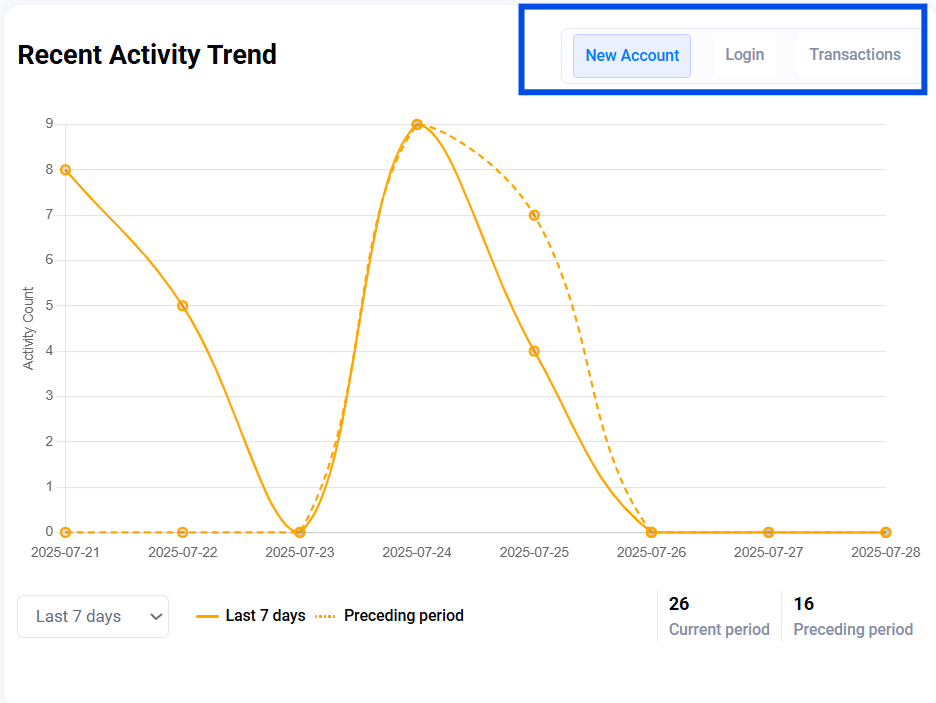
This section displays trends for new accounts, logins, and transactions over the selected time range (e.g., Last 7 days in the below snapshot). It helps you spot unusual activity spikes or sudden drops, which may indicate a fraud campaign in progress.
You can click on the respective tab on the upper right corner to view the trends for each, as highlighted in the image below. You can also use the time period picker at the bottom to filter the results.
Example use: A sudden surge in new accounts may suggest bot activity.
Review Fraud
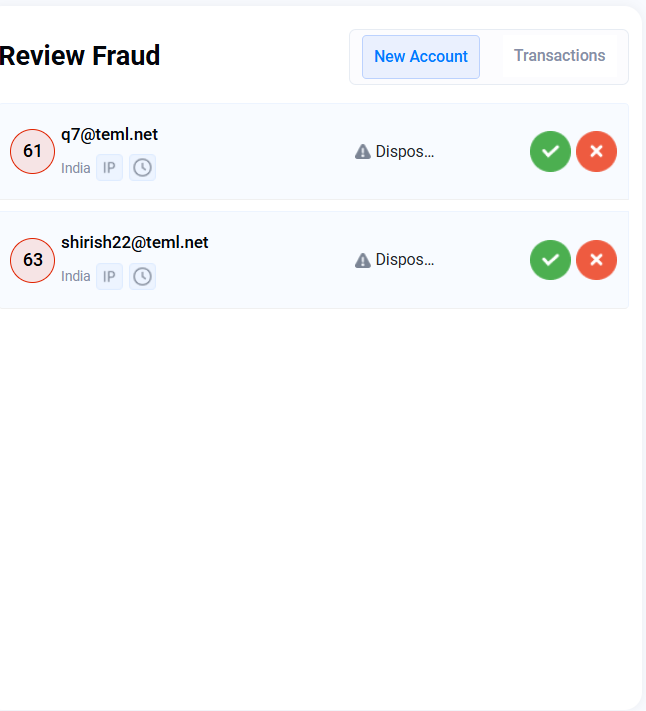
It helps you identify cases that require manual review. Here, you’ll find actions related to new signups and transactions that couldn’t be auto-approved or denied and were flagged for human investigation. Reviewing these helps refine fraud models and prevent false positives.
You can approve or disapprove the respective activity using the green tick and red cross buttons provided.
New Account: Suspicious registrations
Transactions: Payments flagged for further review
Decision Trends
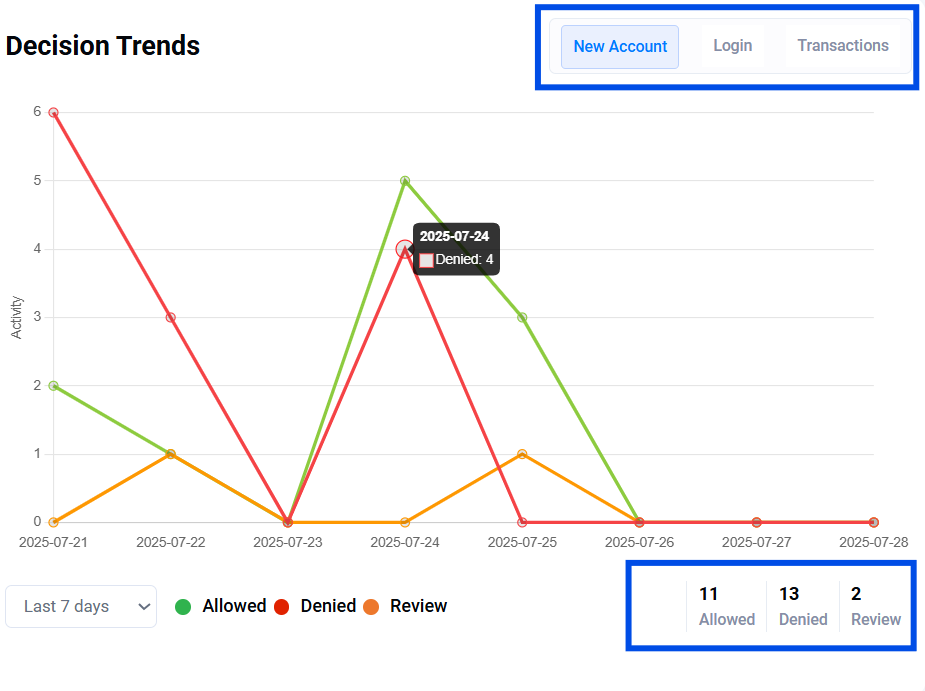
This panel shows how many user actions were:
Allowed (safe)
Denied (blocked)
Review (borderline cases)
Users can view the exact counts for each category in the bottom-right corner of the panel. Alternatively, hovering over the graph points reveals specific dates and corresponding values. Use the tabs in the top-right corner to switch between views for New Account, Login, and Transactions activity.
You can also use the time period picker at the bottom to filter the results.
Fraud Score
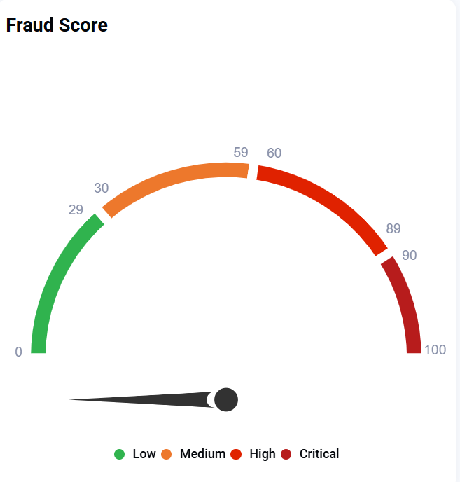
Fraud score is the average fraud rate on the customer's platform. This rate is calculated based on all activities in the last 24 hours. For example, if there were 100 activities (logins, transactions, registrations combined) in the last 24 hours, and 90 of them had a high risk score, then the fraud rate is 90% which is critical.
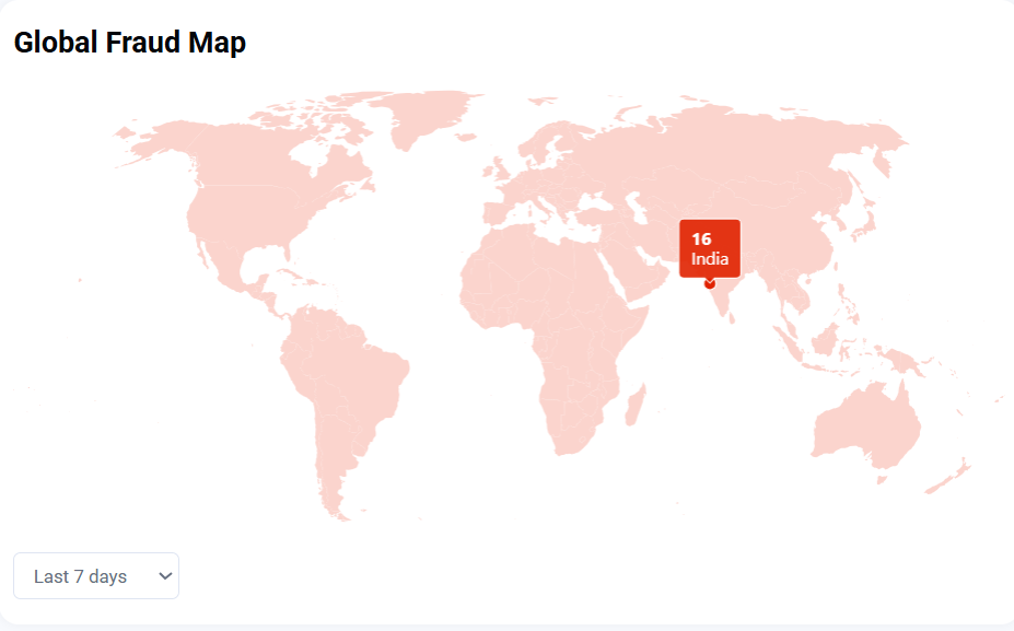
Global Fraud Map
This map highlights the geographic sources of fraud, showing signals by country or region. It helps identify high-risk areas, enabling you to apply location-based rules or step-up verification where needed. Click on any highlighted region to view the specific location name.
You can also use the time period picker at the bottom to filter the results.
Top Threats
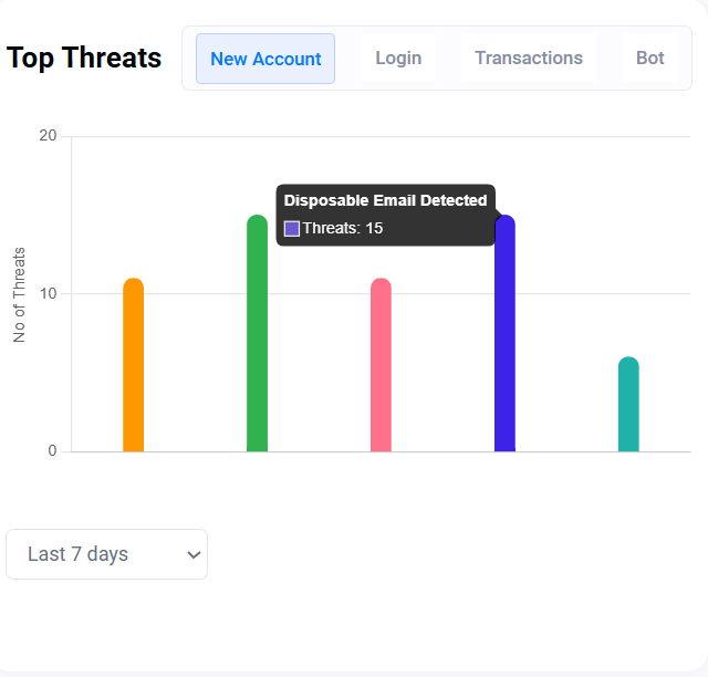
This section highlights recurring fraud patterns and lists the most common threat types detected, grouped by action:
New Account: Fake or bot signups
Login: Account takeover attempts
Transactions: Fraudulent payments
Bot: Automated abuse targeting your site
Review this section regularly to identify evolving abuse trends and respond with appropriate fraud rules.
In the snapshot below, the user can see that multiple threat types were detected under the New Account category. Hovering over any graph point reveals specific details about each threat, as in the image below, disposable emails were detected 15 times.
My Plan
It helps you view your current Sensfrx subscription and usage, and displays your active plan type, including usage metrics as depicted in the image.
Plan: The respective active plan
User: Number of users using the platform
Credit Balance: Total credits remaining
Data Visibility Limits: How long data will be visible
Data Retention: This defines how long your data will be retained in our databases.
Custom Validation Rules: Number of custom validation rules created by you.
Use this to monitor consumption and upgrade your plan if necessary. 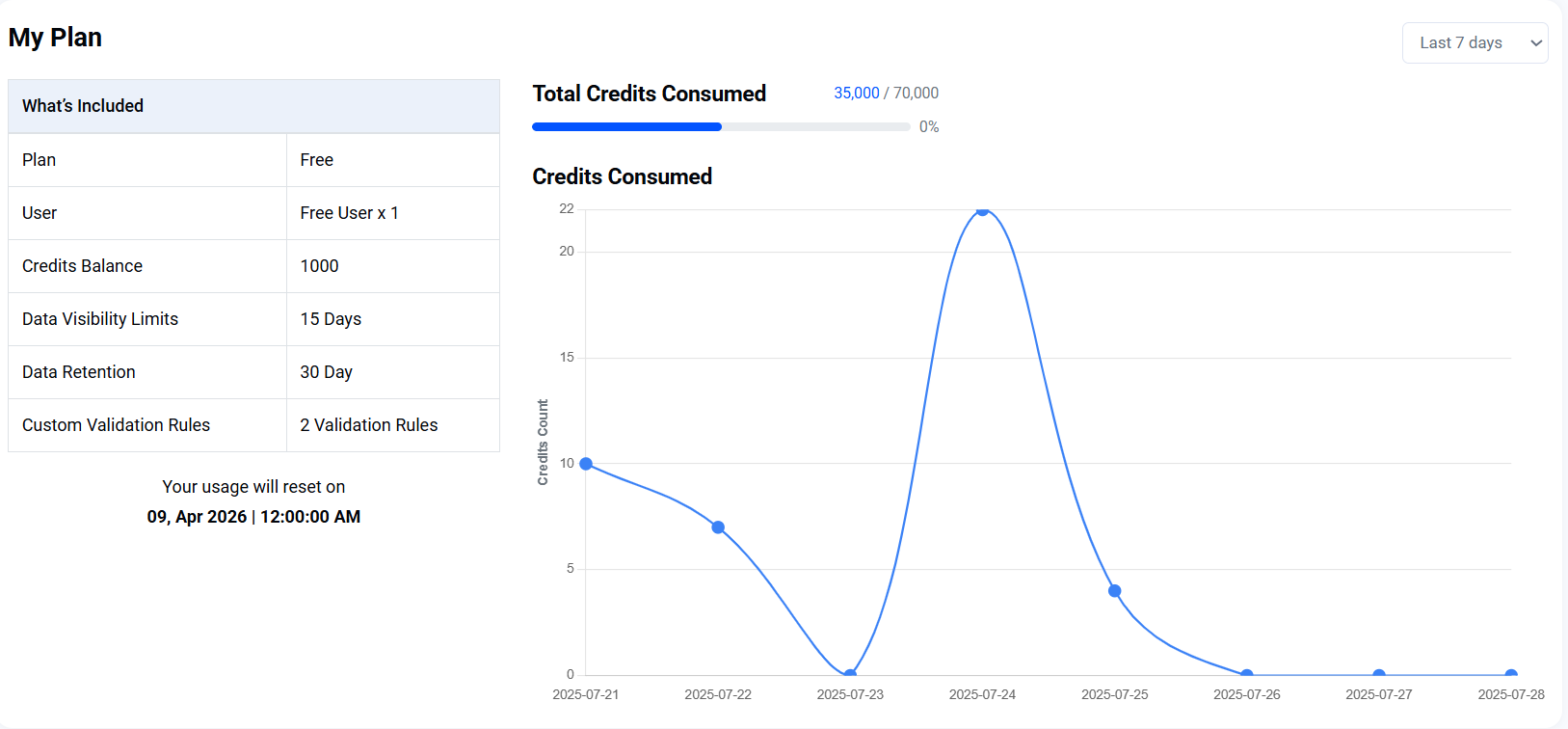
The Sidebar
The sidebar contains all the tabs that allow you to navigate and view the fraud analytics detected on your platform. They comprise:
Home: This is the main dashboard view and landing page after you log in. It gives you a quick overview of recent fraud trends, activity, and key metrics.
Account Security: It helps you monitor and investigate suspicious login attempts, account takeovers, and unauthorized access. This section helps safeguard user accounts on your platform. Explore it here.
Transactions: It helps you to view fraud analysis for all transactions processed through your system. Track patterns, review decisions, and detect suspicious payment behavior. Explore it here.
New Accounts: Detect fake signups, synthetic identities, and risky registrations. Analyze behavior and signals associated with new account creation. Explore it here.
Bots: Identify and review bot activity attempting to abuse your platform. This section highlights scraping, brute-force, and automated behavior. Explore it here.
Policy Engine: Manage your custom fraud rules and logic here. Create, test, and refine policies based on risk signals, behavior, and business logic. Explore it here.
Reports: It provides you with the details of the false positives recorded on the system.
Settings: Configure account preferences, API keys, property details, and integration settings. This is where you control how Sensfrx connects to your platform. Explore it here.
